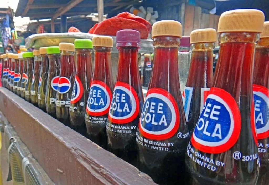
When brands want to expand globally, they need to be extra careful with the way their slogan and brand names are translated, as well as with the cultural implications of their choices.
Even choosing a colour can have catastrophic consequences, as colours can have different connotations in different cultures. For example, Pepsi made an epic blunder in South East Asia when they decided to change the colour of their vending machines from deep blue to light blue. This colour is indeed associated with death and mourning in that region. Who would want to associate a drink to death?
In Africa, due to the low literacy rate, it is normal to use pictures of the product on the label in order to explain what is inside. Gerber, the children’s food brand, decided to keep the image of its smiley baby on their jars and packages. No wonder why the brand never really succeeded there.
Not to mention the consequences of mistranslating company slogans. The Scandinavian Electrolux decided to use the following logo in the US for their vacuum cleaners: “Nothing sucks like an Electrolux”…
Apparently the mascot of the vegetable company the Green Giant, “The Jolly Green Giant”, was translated in Arabic as “Intimidating Green Monster”. Kids usually struggle with eating vegetables, and I suppose an intimidating green monster doesn’t really make things easier.
Marketing mistranslations can ruin the brand’s reputation and its chances of succeeding in a foreign market. Here is a video with some of the funniest names for products that clearly went wrong in translation.


